
To Life, Love & Loot: a Lockup and a Kit
2010 / Anomaly
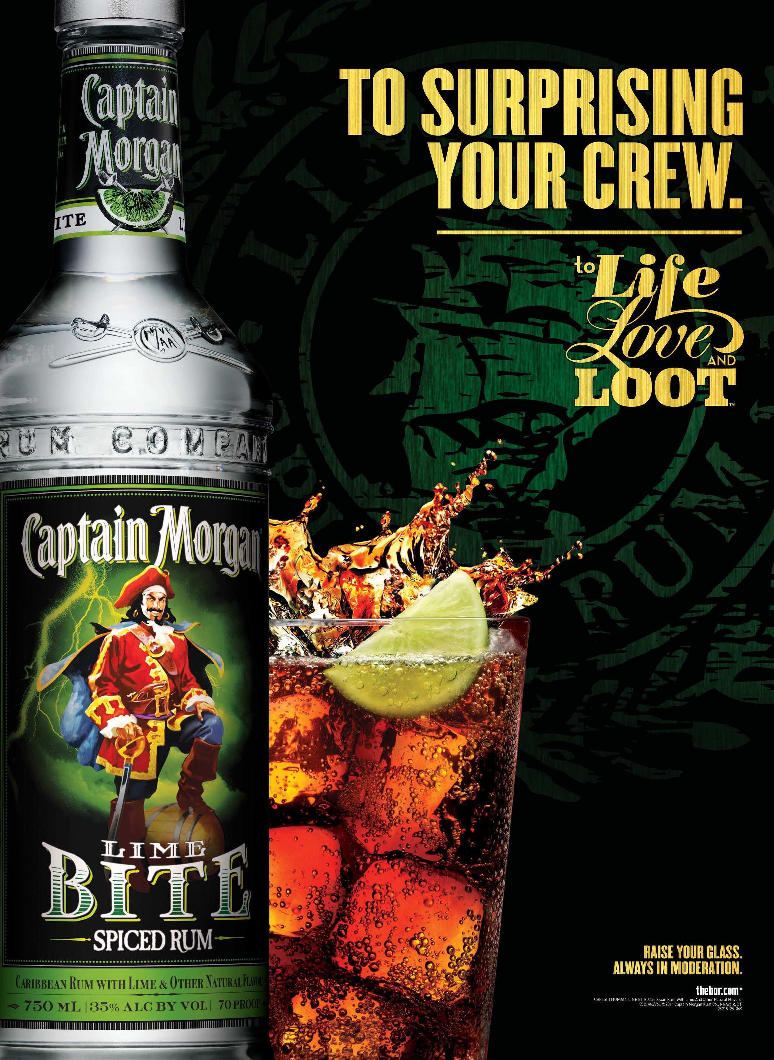
My first go-around at Anomaly started on Captain Morgan, working art direction and design for the brand’s identity. The brief was great: something different from before. Refined, but still very piratey. I’m not normally one to mix type all willy nilly, but I thought each word of the tagline "To Life, Love and Loot" had very different meaning and character. So I made an adventure of a lockup.
Like a ship run aground in a storm of rum-soaked cola., there's a sort of drunken revelry quality to the logo lockups. A kind of silliness that for me, makes them actually kinda fun to read.
Logo Lockups


After the lockups were…locked up…I put together a toolkit for all the various agencies that might touch the brand.
Like any liquor brand, they needed something foolproof and hardworking. But I thought it might be nice to add a little art to things. We put all kinds of Baroque still life-inspired table dressings in the toolkit so people could sprinkle some dramatic pirate nonsense into their layouts.
Toolkit


Hey listen, not everybody ended up using all the nice still life stuff. Turns out POS and OOH agencies sometimes feel the product and the headline is all you should really see. But I tried, right?
Btw if you’re a spiced rum person, Captain Morgan Private Stock is actually kind of great.
If it’s not Baroque, don’t fix it.


If you liked this work,
you might also like the people who worked on it.
Jon Zast, Creative Director
Andy Carrigan, Creative Director
And you might like
these projects:
Food as it Should Be
Another thing I did at Anomaly that was basically a bigger, more successful set of brand guidelines.
Attack!
A collection of well-designed projects, some of which are brand guidelines.
Budweiser
Another Anomaly thing that was less about toolkits and more about positioning, plus it actually ended up creating a long-term guidelines for Bud.